Daily Creates: June 15 – June 21
This week’s daily creates are not available on the website, so instead I am going to try to create a few data visualization dashboards that I find interesting.
The data visualization that I created provides insight on the current world cup, and which continent has been the most successful thus far.
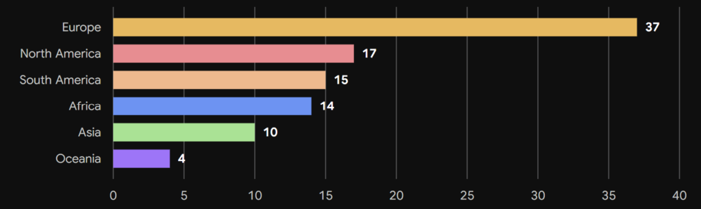
This data visualization demonstrates the effectiveness of the Coherence Principle as well as the Signaling Principle, as the ordering and placement of the data allows readers to quickly see the most and least successful continents, while the simplicity allows it to be easily understood.
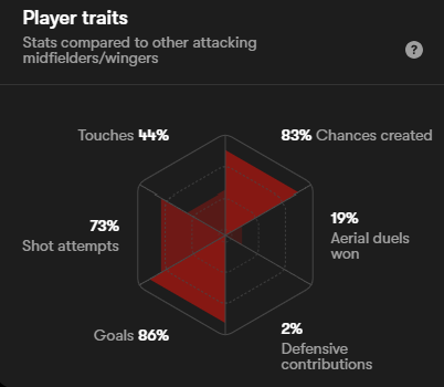
Another data visualization I enjoy viewing are individual player statistics when compared to other in similar positions. I find this data visualization particularly interesting, as a viewer can quickly understand how a player compares to other in a similar position. This emphasizes the Contiguity Principle, as the positioning of the data together allows readers to comprehend the player more easily.